Layout of question in the registration form
A question in the registration form is made up of the question and the choice of answer or an open-ended question without an answer.
To ensure that the layout of the questions looks the same on your computer, tablet and phone, both the question and the pre-filled answers mustn't be too long.
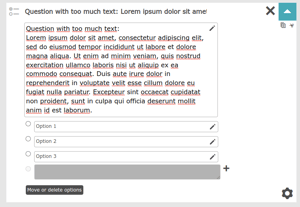
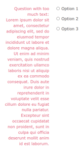
If the actual text of the question/ the answers are too long, the lay-out of the registration form will be disturbed and it might look strange and unclear to the participant, like this:


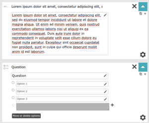
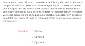
If you do want to give a more detailed explanation of a question or a couple of answers, use a text box before or after the relevant question, then it will look like this:


 Tip
Tip
When making changes, keep a close eye on the preview website, where you can instantly see how a change affects the layout of the registration form.